Design Tokens
for T-Mobile Design System
"Design tokens are design decisions, represented as data, that
ensure systematically unified and cohesive product experiences."
— Spectrum, Adobe’s Design System
The key to design tokens is that they facilitate cross-disciplinary collaboration. Tokens ensure that every element of the same type is the same across the entire design network.

- • Inconsistent brand experience between platforms
- • All values are hardcoded which makes it difficult to make any changes
- • We had multiple internal/external teams that define all sorts of digital experiences amongst digital channels. Too much time is spent working out a simple style of communication.
Before diving into building the tokens, I've tried to visualize the high-level idea of how tokens will work in our company and how they will potentially solve our problems.
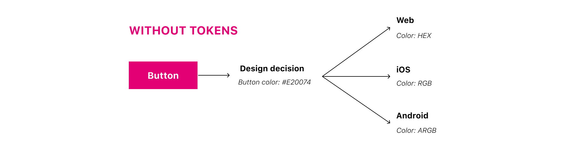
Our process of communication design decisions before tokens:
Every platform uses different measurements to describe values: for colors, the
web
used HEX, iOS - RGB, for spacing on the web we used px,
for Android dp, etc.
As a result, it added a lot of additional work and communication between
developers and designers.
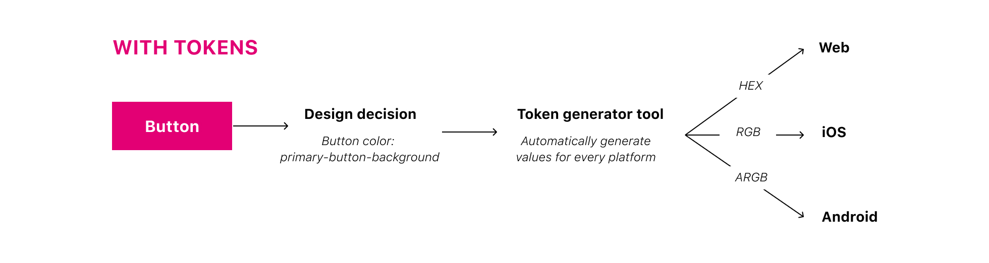
How it will look with a tokens system:
When a token name is assigned to the color, designers can manage the hard-coded color value associated with that token, and it will be changed automatically in a code for every platform.
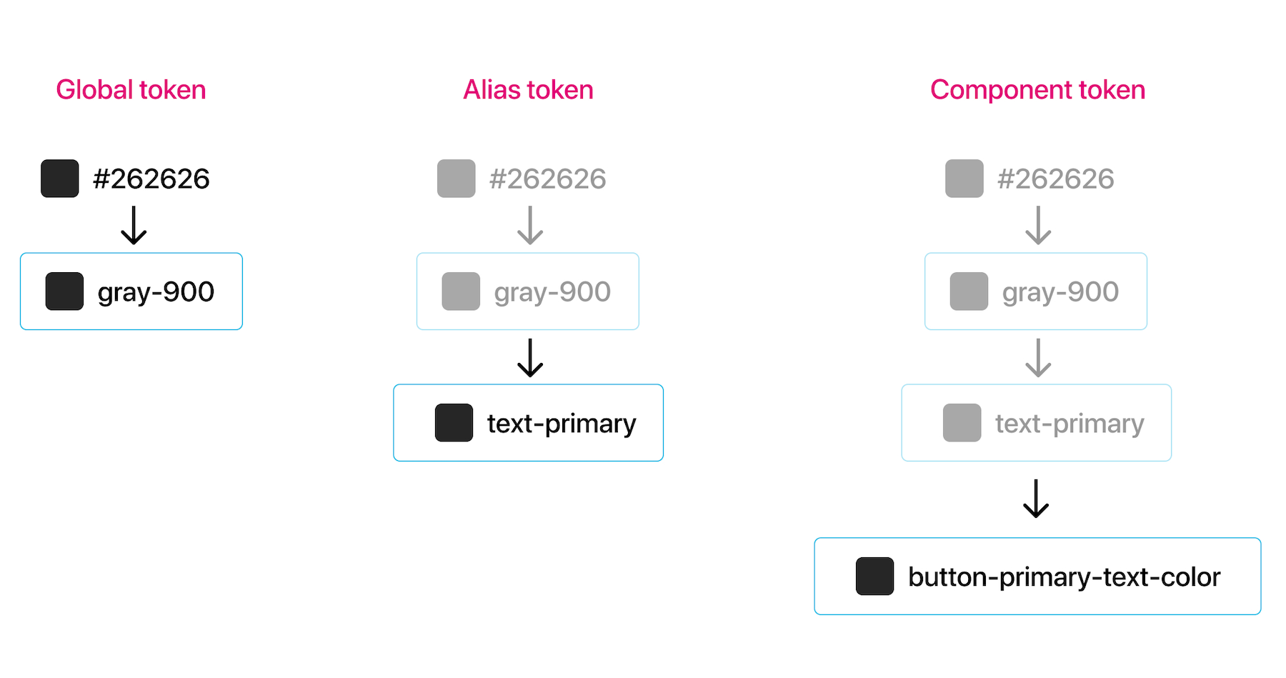
Based on my research and exploration I've decided to break down a token system into three levels.
Global tokens: base elements of the design such as color, animation, typography
Alias tokens: global tokens don’t necessarily bridge the gap between naming and use. Designers need to know what options they should apply in a particular context, and that’s why we use alias tokens
Component tokens: these are very specific representations that often derive from an alias; use to evolve design elements.
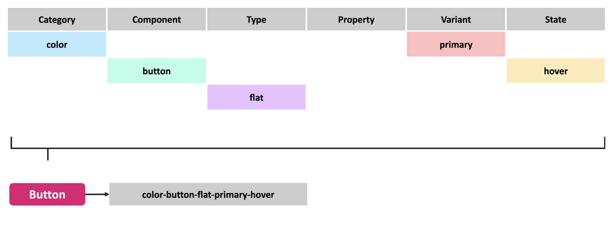
Naming tokens is one of the important parts of the process. Every token must have a name and the name must be unique for that token type.
Effective token names improve and sustain a team’s shared understanding of visual style through design, code, and other interdisciplinary handoffs. I've approached the naming by creating levels, separating and describing tokens by category, type, property, state, etc.
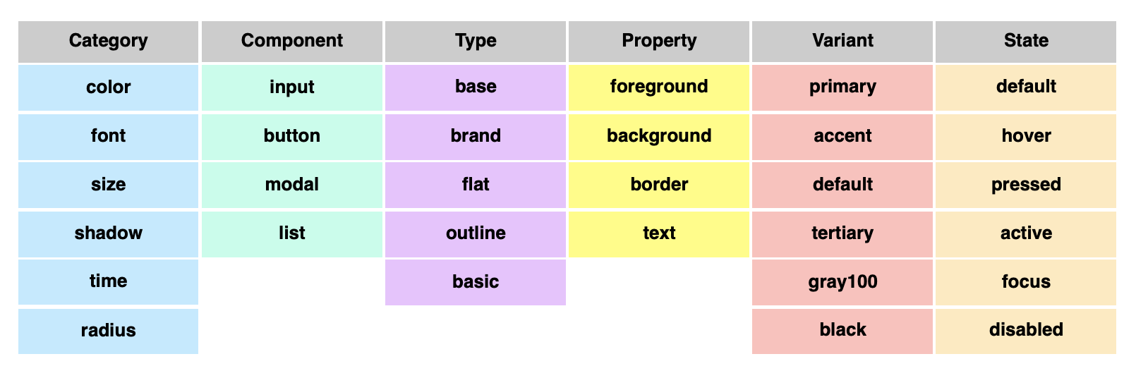
Below is an example of how we named our primary button component using our token naming system.
For the design system team:
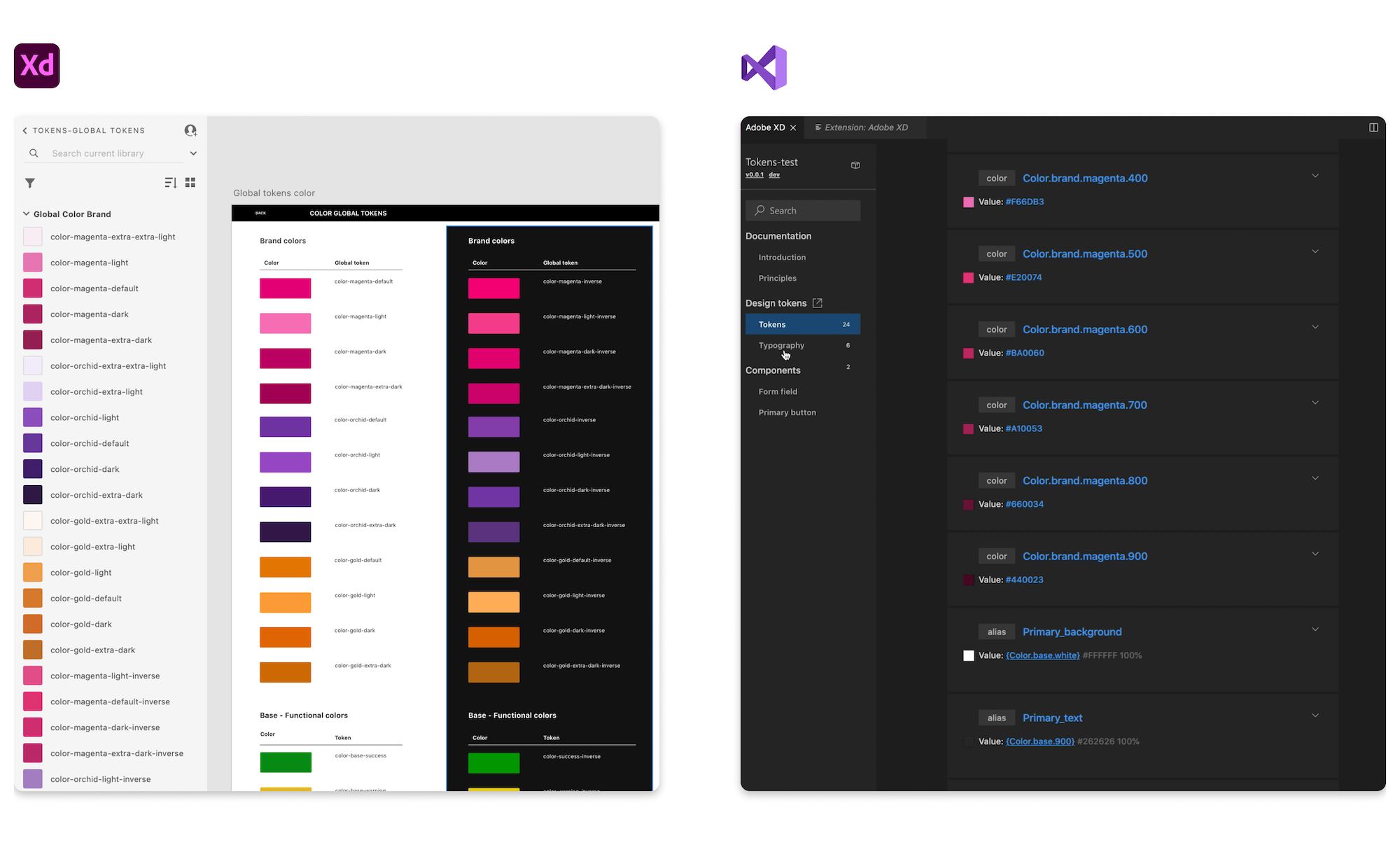
After we created a naming system and get approval from the teams, I’ve started to create tokens documentation in Adobe XD for the foundation elements such as colors, typography, sizing.
When my documentation was ready I’ve shared the XD token library link with a design system developer who, by using the Adobe XD extension for Visual Studio Code creates Design System Packages (DSPs) that contain all information developers need to reference while coding, including compiled design tokens, code snippets, and design systems documentation.
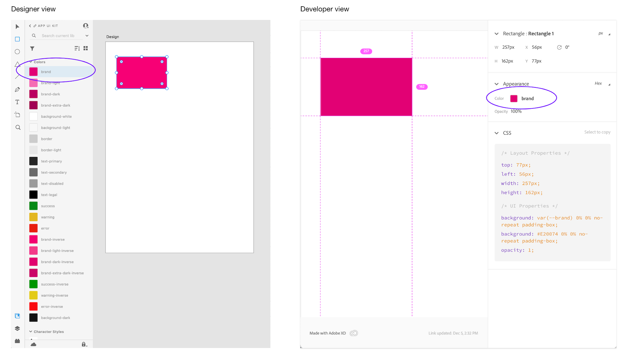
How it works in the designer-developers handoff process:
The design system team has added token naming to every foundational element of our UI kit library, so designers while building their designs just have to select the right element from the library and it’s automatically will assign the right token name. The developer, when receiving the design prototype, will see the component together with the correct token name..
In parallel with the token project, a company was making a migration from the Adobe design tool to Figma. It allowed us to put the token organization to the next level.
T-Mobile has different lines of business which means that we needed to deal with different theming options. Using the Figma Token Plugin we organized our foundation and components by theming directly in the Figma and helped us to create a scalable token theming across a line of businesses.
What we achieved with the token system:
For internal teams:
• Streamlined the delivery process between design and development
• Avoided manually redlining and time saving
• Reduced errors and increased design automation
• Reduced dev reworking effort when updates needed
For customers:
• We are a step closer to creating a consistent UI/UX across platforms
• We aligned brand styles across all platforms